


Project: Convention Identity Pitch for the Canadian Labour Council
Agency: Point Blank Creative
Role: Lead Designer
The following identity concepts were pitched for the annual Canadian Labour Council 2020 national convention. The theme for the convention was defining the future. The goal for the identity was to ignite and define a hopeful path for the future of the labour movement in Canada. These identities are bilingual in both French and English. Due to COVID-19, the convention was postponed.
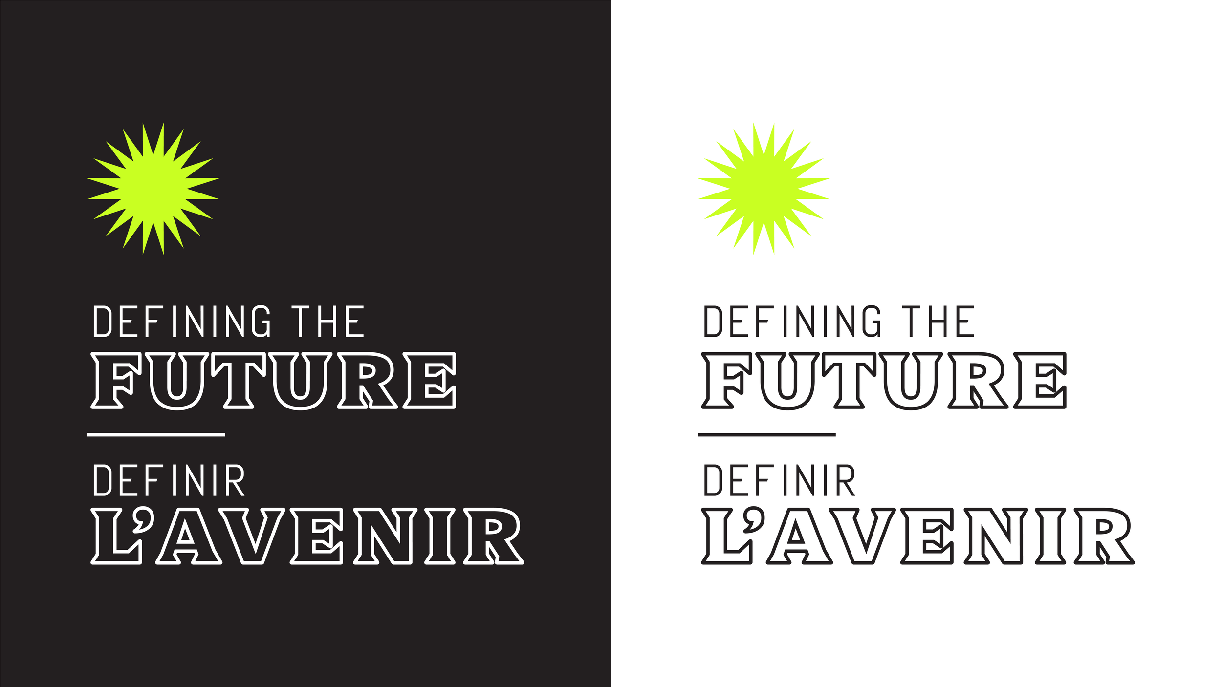
Wordmark for the identity created in both light and dark versions.
This concept is both bold and simplified. Abstract shapes and distinct colours give the flexibility to play between flashy and bold or a simpler and toned down application of the identity.
Themed versions of the wordmark design for the various days and/or workshops the convention would have been broken out into. An abstract rose for fighting the right, a stacked shield for the future of work, a human shape for human rights and, a planet for climate action.
Pattern and colour palette.
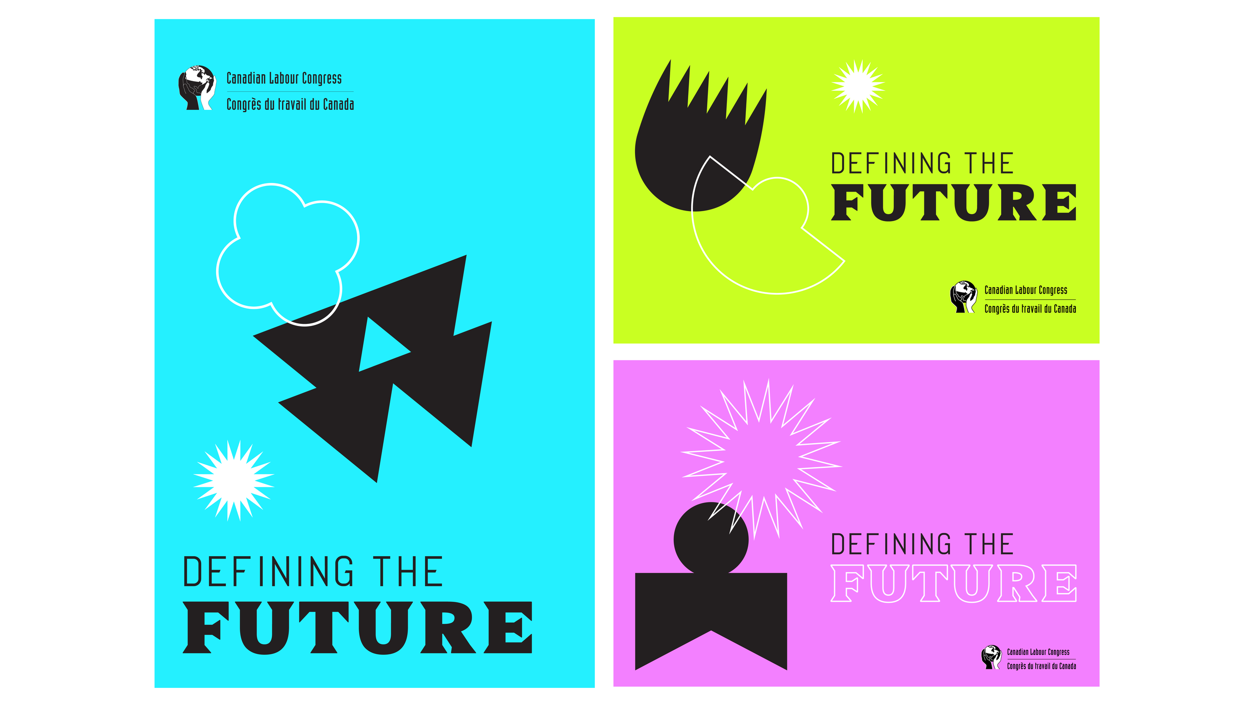
Examples of what the brand would look like in use. These were design as potential poster or banners for the convention promo.
This was the second visual language I pitched for the convention identity. Dynamic shapes and sturdy typography are used alongside an energetic palette to create an exciting vision for the future of the workforce. Animation of the pattern is central to this identity but can be successful in static applications as well.
The wordmark reversed in a light colour treatment.
Themed versions of the wordmark design for the various days and/or workshops the convention would have been broken out into. With the themes stack on the bottom of the wordmark, I’ve chosen a specific colour to represent each one. Energetic pink for fighting the right, forest green for climate action, hopeful blue for human rights and, a blazing yellow for the future of work.
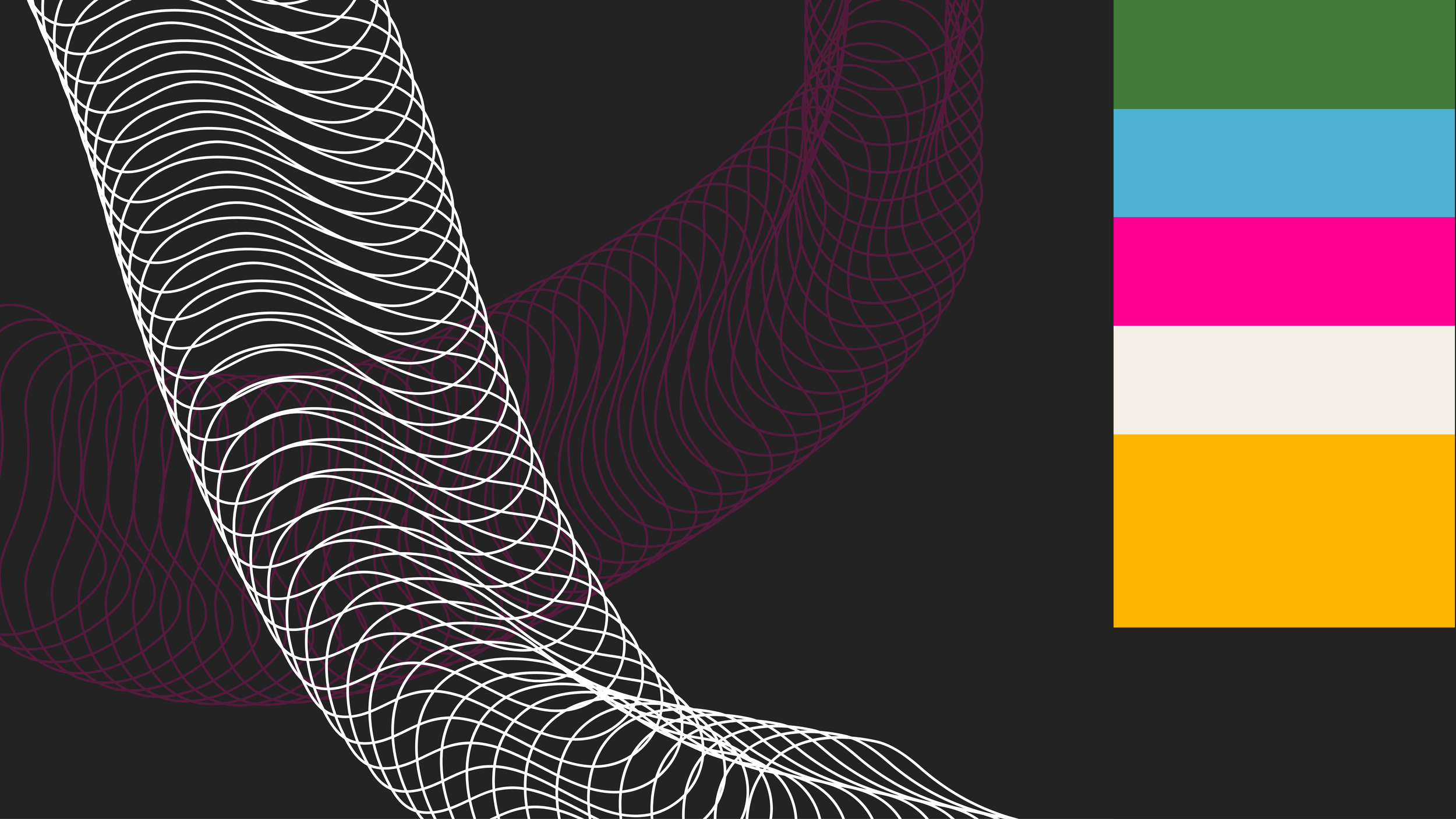
Pattern and colour palette.
Examples of the second brand identity in use. The sample shown in the bottom right was created as a sample of screen signage, the wave added to the wordmark was a pitch for how we could animate the identity. It was pitched that the lines within the pattern would move as well.